A studio team working at desks with dual monitors

Case studies

What was wrong, what we built, and what changed, for eleven real projects.

“Every link on this page opens the real thing. Click through and judge the work for yourself.”

How to read this page

Live clients are sites we fix, rebuild and look after every month. Web apps are working builds with real logins and data. Design concepts are commissioned homepage builds, delivered as working pages rather than flat images.

Showing 11 of 11

01Live client · Fitness

Sporten voor je Deur

Zeist, Netherlands

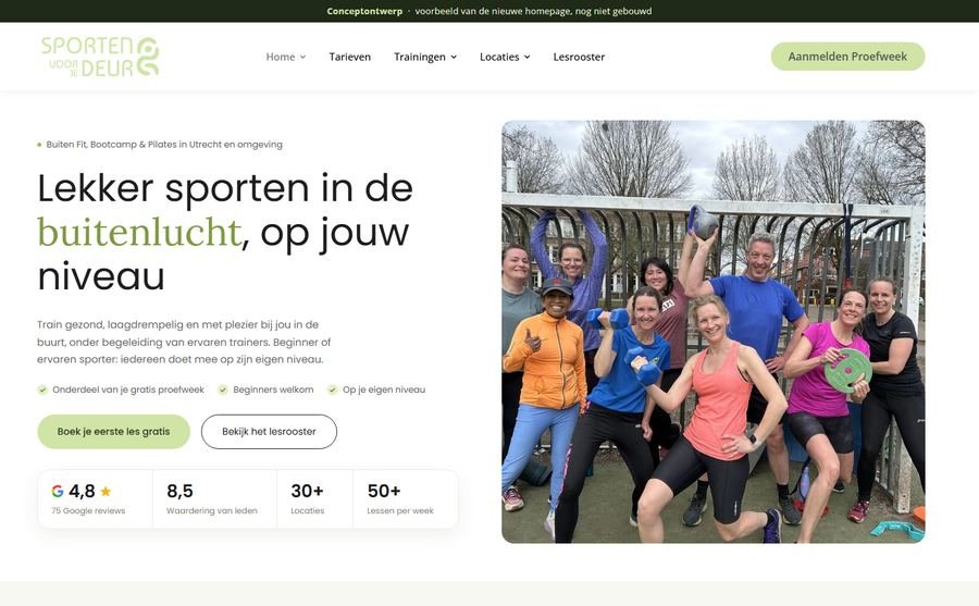
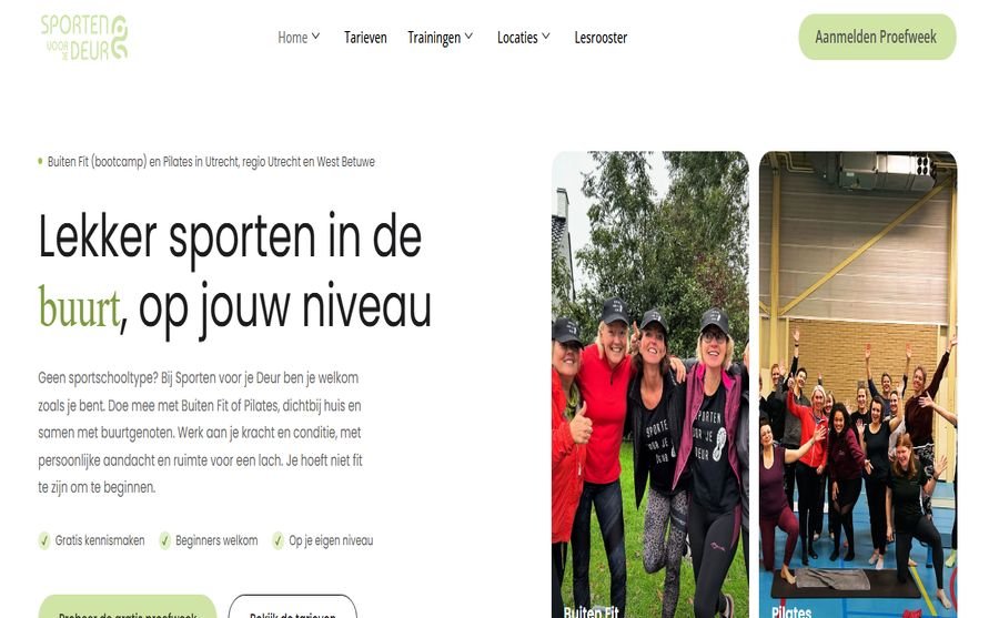
A long running client. An outdoor fitness business running classes at more than thirty locations, with a website that looked right but was not converting the interest it got. The footer form on every page asked for an email address and nothing else, so enquiries arrived with no name and no phone number, which made them hard to act on. On the blog template the notifications were going to the wrong address.

We rebuilt both forms. Then we fixed the on-page SEO, which barely existed, set up cookie consent properly, and took on the monthly maintenance. This autumn she asked for a new homepage built around one decision: book the free trial.

Message from the client: Wauw looks very good!!! You are doing great work, this is what we need to make the customer journey easy
The client, after seeing the new homepage
  • Rebuilt the forms that were losing enquiries
  • Fixed notifications going to the wrong mailbox
  • On-page SEO: titles, descriptions, headings
  • Google Consent Mode v2 and tracking
  • New homepage designed around the free trial
  • Ongoing monthly maintenance and SEO
02Live client · Gym

Fitcentrale

Netherlands

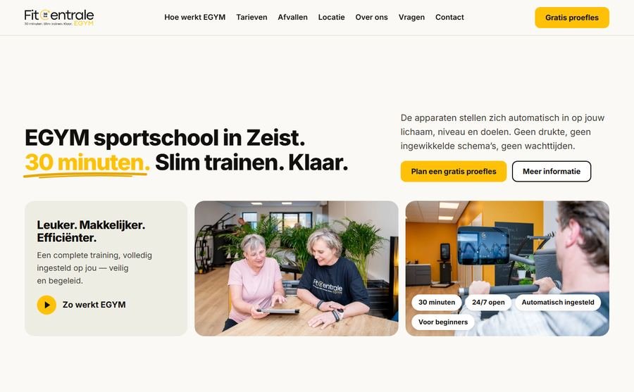
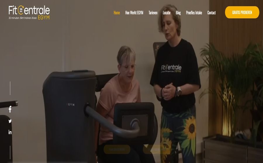
The same owner also runs a gym business. Its contact form showed a thank you message on submit, but the automation behind it had been switched off at some point, so the messages were no longer being delivered.

We traced it, replaced it and tested it end to end. We also restored the trial booking page, where the booking widget had been replaced by a contact layout. Since then we rebuilt the homepage and inner pages.

  • Found and replaced a contact form that silently discarded every lead
  • Restored the trial booking page
  • Rebuilt homepage and inner pages around the trial
  • Pricing made readable
  • Ongoing maintenance, tracking and SEO
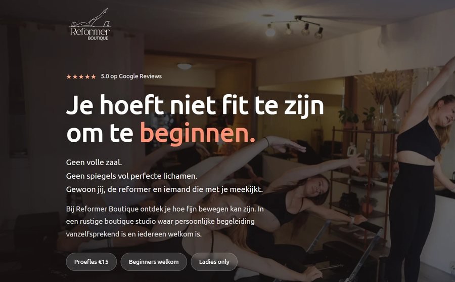
Reformer Boutique pilates studio live website The live website
03Live client · Pilates studio

Reformer Boutique

Utrecht, Netherlands

A reformer pilates studio that wanted paid traffic to turn into booked trial classes, not just visits.

We built the Google Ads landing page in Dutch, split the pricing so memberships and class passes stop competing with each other, and wired the contact form through to a thank you page so every enquiry is counted instead of guessed at.

You are so fast! Amazing! thank you!
Sterre Fleur, Reformer Boutique
  • Dutch landing page for Google Ads
  • Memberships split from class passes
  • Thank you page redirect so conversions are tracked
  • Ongoing maintenance
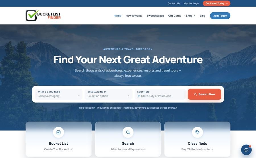
BucketListFinder directory homepage design with search and categories first The homepage we designed
04Design concept · Directory

BucketListFinder

United States

A paid directory for adventure and travel businesses: members pay to be listed, plus classifieds, sweepstakes and an affiliate shop. The brief had a hard constraint: the site runs on a hosted directory platform, so the design had to be buildable inside that platform's templates.

We designed the homepage around the thing that pays: search first, then categories, then featured members. The directory has member logos but few member photos, so the featured cards were built logo first. Brand colours kept exactly.

  • Homepage redesigned within platform constraints
  • Search and categories first
  • Logo first cards for paying members
  • Eleven page design brief delivered with the page
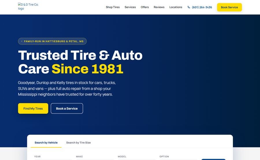
D & D Tire Co. homepage design with video hero, services and three locations The homepage we designed
05Design concept · Tyres & auto repair

D & D Tire Co.

Mississippi, United States

A three shop tyre and auto repair business that wanted to see what a modern homepage would do for them, so we built one rather than describe it.

The page leads with a video of the shop, puts services and the three locations where you cannot miss them, and makes the phone tappable everywhere. The reviews are their own: 4.4 stars from 189 Google reviews, with five real quotes, so anybody can check them.

  • Homepage built as a working page, not a picture
  • Video hero, services and locations up front
  • Tap to call throughout, mobile first
  • Real Google reviews, nothing invented
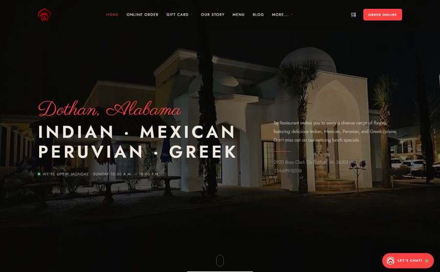
Taj Restaurant homepage design built around online ordering The homepage we designed
06Design concept · Restaurant

Taj Restaurant

Dothan, Alabama

An Indian, Mexican, Peruvian and Greek restaurant with more than 1,700 Google reviews, where online ordering deserved to be the first thing a hungry visitor sees.

We rebuilt the homepage around ordering. Dishes and drinks became product cards with add to order and a cart that slides in, hours and reservations sit where a hungry person expects them, and on a phone an order and reserve bar stays in reach. Every photo and every word is theirs.

  • Homepage rebuilt around online ordering
  • Dish and drink cards with cart drawer
  • Reservations and hours made obvious
  • Sticky order and reserve bar on mobile
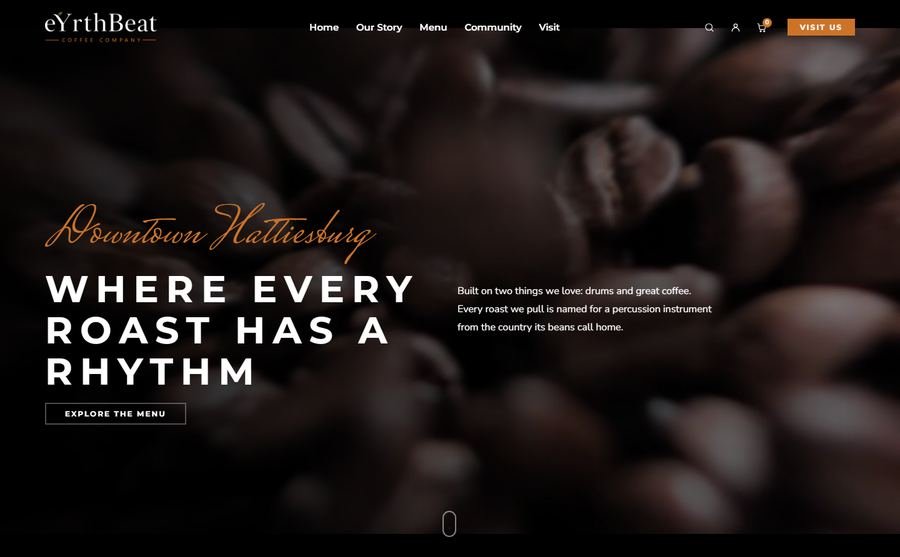
eYrthBeat Coffee Company homepage design led by photography and their story The homepage we designed
07Design concept · Coffee

eYrthBeat Coffee Company

Hattiesburg, Mississippi

A small batch coffee company on Front Street with a genuinely good story: a percussionist who started on one home roaster during the pandemic, and names every roast after a percussion instrument from the country the beans come from.

That story deserves to lead the page. We built a homepage that leads with the story and the room, keeps the menu one click away, and keeps hours and address visible.

  • Photography led homepage built around their story
  • Menu, hours and location in reach
  • Built from their own words and images
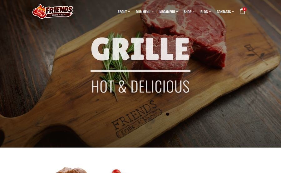
Friends Grille + Bar homepage design with menus split by lunch, dinner and brunch The homepage we designed
08Design concept · Bar & grill

Friends Grille + Bar

Bar and grill

Southern classics made from scratch, a full bar, weekend brunch and a dining room built for gathering. The site needed to carry all of that without turning into a menu dump.

We put the menus first, split by lunch, dinner and brunch, added the seasonal produce and the local farms the kitchen is proud of, and kept gift cards, private dining and booking within reach on a phone.

  • Menus split by service and put first
  • Events, gallery and private dining built in
  • Booking call to action always in reach
09Web app · Property portal

Webrix Estate

Property portal

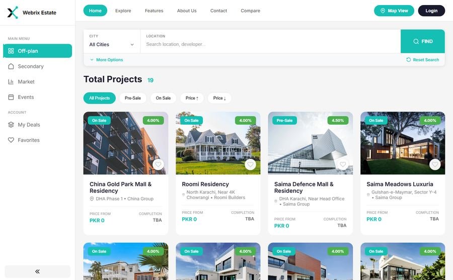
Not every job is a brochure site. Webrix Estate is a working property portal: projects and listings with search and filters, off plan and secondary sections, a map view, saved favourites and a login, plus an admin area where the team adds and edits everything without touching code.

It is the build we point to when somebody asks whether we can do more than pages.

  • Project and listing search with filters
  • Map view, favourites and user accounts
  • Enquiry capture into the back office
  • Admin area for the team to run it
10Web build · Real estate

Executive Realty

Amarillo, Texas

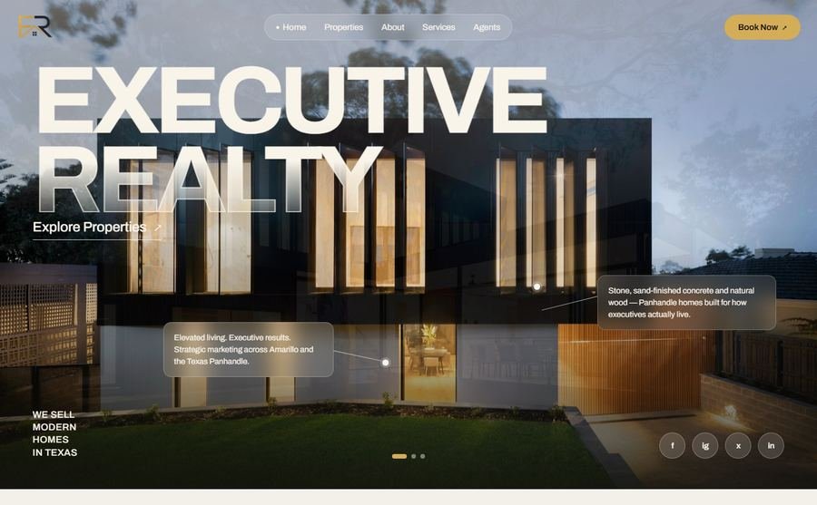
A single realtor needs the opposite of a portal. No dashboards, no logins, no clever filters, just a site that makes a seller pick up the phone.

This one leads with the building and the promise, then properties, then the agents behind them, with a booking call to action that follows you down the page. Dark, photography led and quick on a phone, because that is where the ad click comes from.

  • Property grid with detail pages
  • Agent profiles and services
  • Lead form and booking call to action
  • Designed for ad traffic, mobile first
Roomi Towers single page property launch with floor plans and payment plan The launch page
11Web build · Property launch

Roomi Towers

Property launch

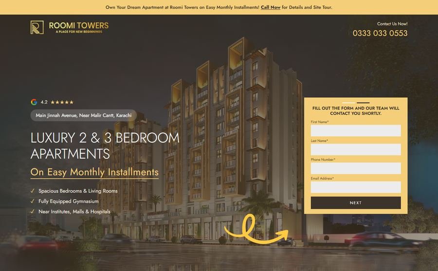
A property launch has one job: turn ad spend into booked viewings before the campaign ends.

A single page with the floor plans, the payment plan and the gallery in the order a buyer asks for them, and a form that routes straight to sales. No navigation, nothing to wander off into. One page, one decision, fast on a phone.

  • Single page built for paid traffic
  • Floor plans, payment plan and gallery
  • Form routed straight to sales

Ready to work with us?

Tell us the goal. We come back with a scope, a timeline and a number.